> ## Documentation Index
> Fetch the complete documentation index at: https://docs.suprsend.com/llms.txt
> Use this file to discover all available pages before exploring further.
# Popover feed
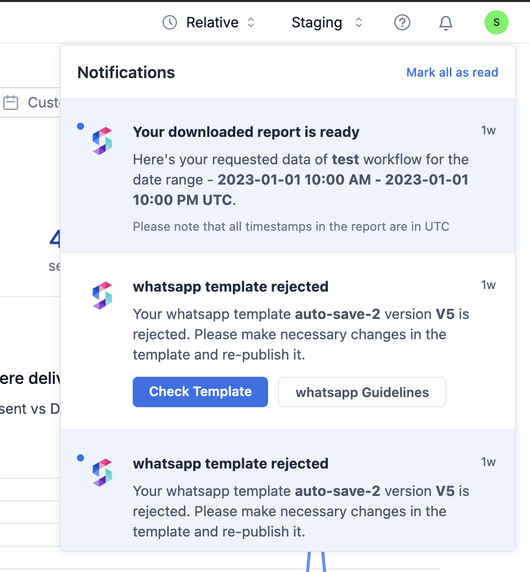
> Add a SuprSend in-app popover notification feed to your React app using drop-in components, with bell icon, unread badge, and customisable notification UI.
For react applications you can implement InApp feed using our Drop-In components (popover, full screen and side sheet notifications) or Build your own UI using headless react hooks.
**New to SuprSend?** Check out [example app](/docs/task-management-app-guide) with In-app Popover Feed and Toast Notifications.
## Inbox (Popover Feed)
```javascript Example.jsx theme={"system"}
import { Inbox, SuprSendProvider } from '@suprsend/react';
function Example() {
return (
);
}
```
```javascript TypeDef theme={"system"}
interface InboxProps {
tenantId?: string;
stores?: IStore[] | null; // pass it if you want to use multiple tabs
host?: {
socketHost?: string,
apiHost?: string,
};
pageSize?: number; // defined page size defaults to 20, max value that can be passed is 100
pagination?: boolean; // pass false to disable pagination
theme?: ITheme; // used to customise css styles of existing component
themeType?: ThemeType; // dark or light
popperPosition?: Placement; // placement of inbox popover on click of bell
hideAvatar?: boolean;
showUnreadCountOnTabs?: boolean;
notificationClickHandler?: (notification: IRemoteNotification) => void; // callback executed on click of notification card
primaryActionClickHandler?: (notification: IRemoteNotification) => void; // callback executed on click of primary action button
secondaryActionClickHandler?: (notification: IRemoteNotification) => void; // callback executed on click of secondary action button
bellComponent?: React.FC; // custom component for bell
badgeComponent?: React.FC<{ count: number }>; // custom component for badge
loaderComponent?: React.FC; // custom component for loader
noNotificationsComponent?: React.FC; // custom component when no notifications are present
tabBadgeComponent?: React.FC<{ count: number }>;
notificationComponent?: React.FC; // custom notification card component
headerRightComponent?: React.FC<{markAllRead: () => void,closeInboxPopover: () => void}>; // custom right side header component to override mark all as read etc
}
```
Note: Refer [Customising Feed](https://docs.suprsend.com/docs/customising-feed) for detailed explanation on customisation options available in feed components.
 **Toast Notifications in @suprsend/react**
In the `@suprsend/react` SDK, toast notification functionality is no longer included in Inbox by default. Developers who wish to use toast notifications will need to implement them separately to achieve similar functionality. This change allows for more flexibility and modularity in customizing the user experience.
**Toast Notifications in @suprsend/react**
In the `@suprsend/react` SDK, toast notification functionality is no longer included in Inbox by default. Developers who wish to use toast notifications will need to implement them separately to achieve similar functionality. This change allows for more flexibility and modularity in customizing the user experience.