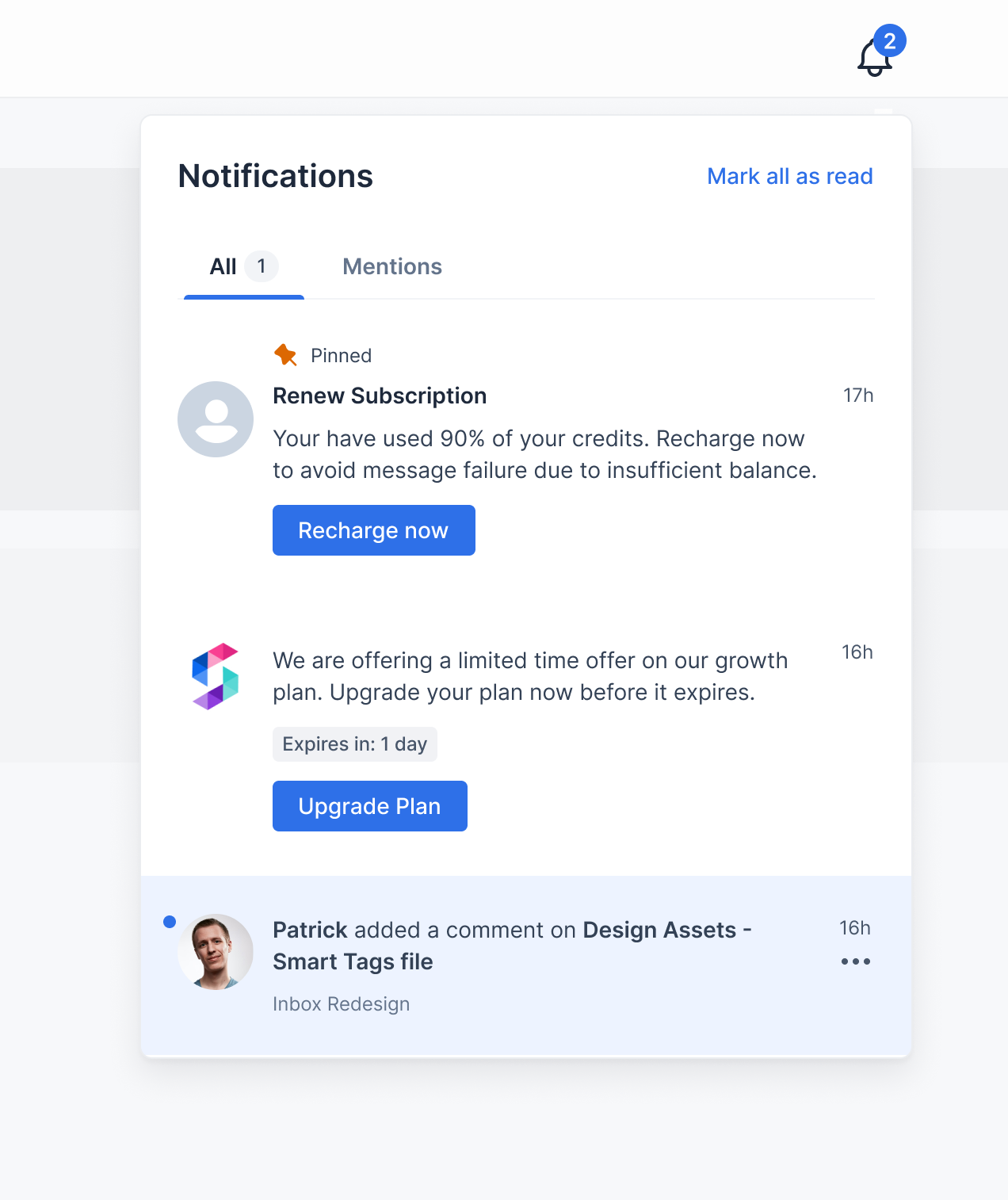
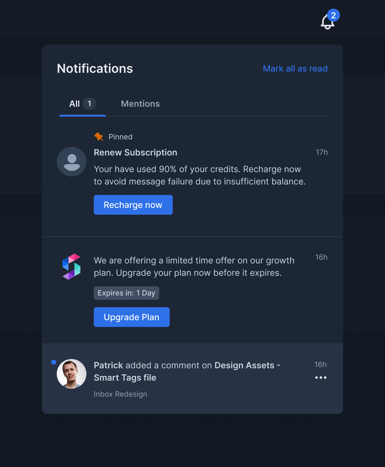
const darkColors = {
  primary: '#2E70E8',
  primaryText: '#EFEFEF',
  secondaryText: '#CBD5E1',
  border: '#3A4A61',
  main: '#1D2635',
  error: '#F97066',
};

const darkInboxStyles = {
  bell: { color: '#fff' },
  badge: { backgroundColor: darkColors.primary },
  ...darkNotificationsFeedStyles
};

const darkNotificationsFeedStyles={
  header: {
    container: {
      backgroundColor: darkColors.main,
      borderBottom: `0.5px solid ${darkColors.border}`,
      boxShadow: '0 0 5px 0 rgba(0, 0, 0, 0.5)',
    },
    headerText: { color: darkColors.primaryText },
    markAllReadText: { color: darkColors.primary },
  },
  tabs: {
    color: darkColors.primaryText,
    unselectedColor: darkColors.secondaryText + 'D9',
    bottomColor: darkColors.primary,
    badgeColor: 'rgba(100, 116, 139, 0.5)',
    badgeText: darkColors.primaryText,
  },
  notificationsContainer: {
    container: {
      backgroundColor: darkColors.main,
      borderColor: darkColors.border,
    },
    noNotificationsText: {
      color: darkColors.primaryText,
    },
    noNotificationsSubtext: {
      color: darkColors.secondaryText,
    },
    loader: { color: darkColors.primary },
  },
  notification: {
    container: {
      borderBottom: `1px solid ${darkColors.border}`,
      readBackgroundColor: darkColors.main,
      unreadBackgroundColor: '#273244',
      hoverBackgroundColor: '#2D3A4D',
    },
    pinnedText: {
      color: darkColors?.secondaryText,
    },
    headerText: { color: darkColors.primaryText },
    bodyText: {
      color: darkColors.secondaryText,
      blockquoteColor: 'rgba(100, 116, 139, 0.5)',
    },
    unseenDot: { backgroundColor: darkColors.primary },
    createdOnText: { color: darkColors.secondaryText },
    subtext: { color: '#94a3b8' },
    actions: [
      { container: { backgroundColor: darkColors.primary } },
      {
        container: {
          borderColor: darkColors.border,
          backgroundColor: 'transparent',
          hoverBackgroundColor: darkColors.main,
        },
        text: { color: darkColors.secondaryText },
      },
    ],
    expiresText: {
      backgroundColor: 'rgba(100, 116, 139, 0.5)',
      color: darkColors.secondaryText,
      expiringBackgroundColor: 'rgba(217, 45, 32, 0.15)',
      expiringColor: darkColors.error,
    },
    actionsMenuIcon: {
      color: darkColors.secondaryText,
      hoverBackgroundColor: 'rgba(100, 116, 139, 0.5)',
    },
    actionsMenu: {
      backgroundColor: darkColors.main,
      borderColor: darkColors.border,
    },
    actionsMenuItem: { hoverBackgroundColor: 'rgba(100, 116, 139, 0.2)' },
    actionsMenuItemIcon: { color: darkColors.secondaryText },
    actionsMenuItemText: {
      color: darkColors.secondaryText,
    },
  }
}