Customising tenant

By default tenantId prop is set to default tenant. If you use multi-tenant architecture and want to fetch inbox notifications of other tenant, you can pass tenant_id prop.

suprsendConfig = { inbox: { tenantId: "suprsend" } };

If you are passing tenant_id in feed, make sure to pass scope key while creating userToken else 403 error will be thrown due to scope mismatching.

Adding tabs

You can pass stores prop to add multiple tabs in feed. For each tab you can write your own logic to get notifications based on tags, notification categories and notification status like read, archived. Read more about it here.

suprsendConfig = {
  inbox: {
    stores: [
      { storeId: "All", label: "all" },
      { storeId: "Archived", label: "archived", query: { archived: true } },
    ],
  },
};

Disable pagination

By default, feed supports infinite scrolling type pagination to get older notifications when you scroll through notifications list. If you want to remove infinite scroll ie., stop getting previous page notifications, you can set pagination=false.

suprsendConfig = { inbox: { pagination: false } };

Enable dark mode

suprsendConfig = { inbox: { themeType: "dark/light" } };
Light ThemeDark Theme

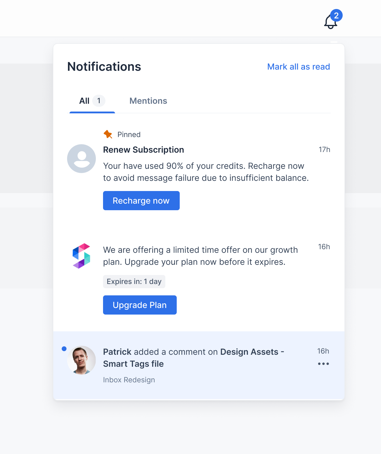
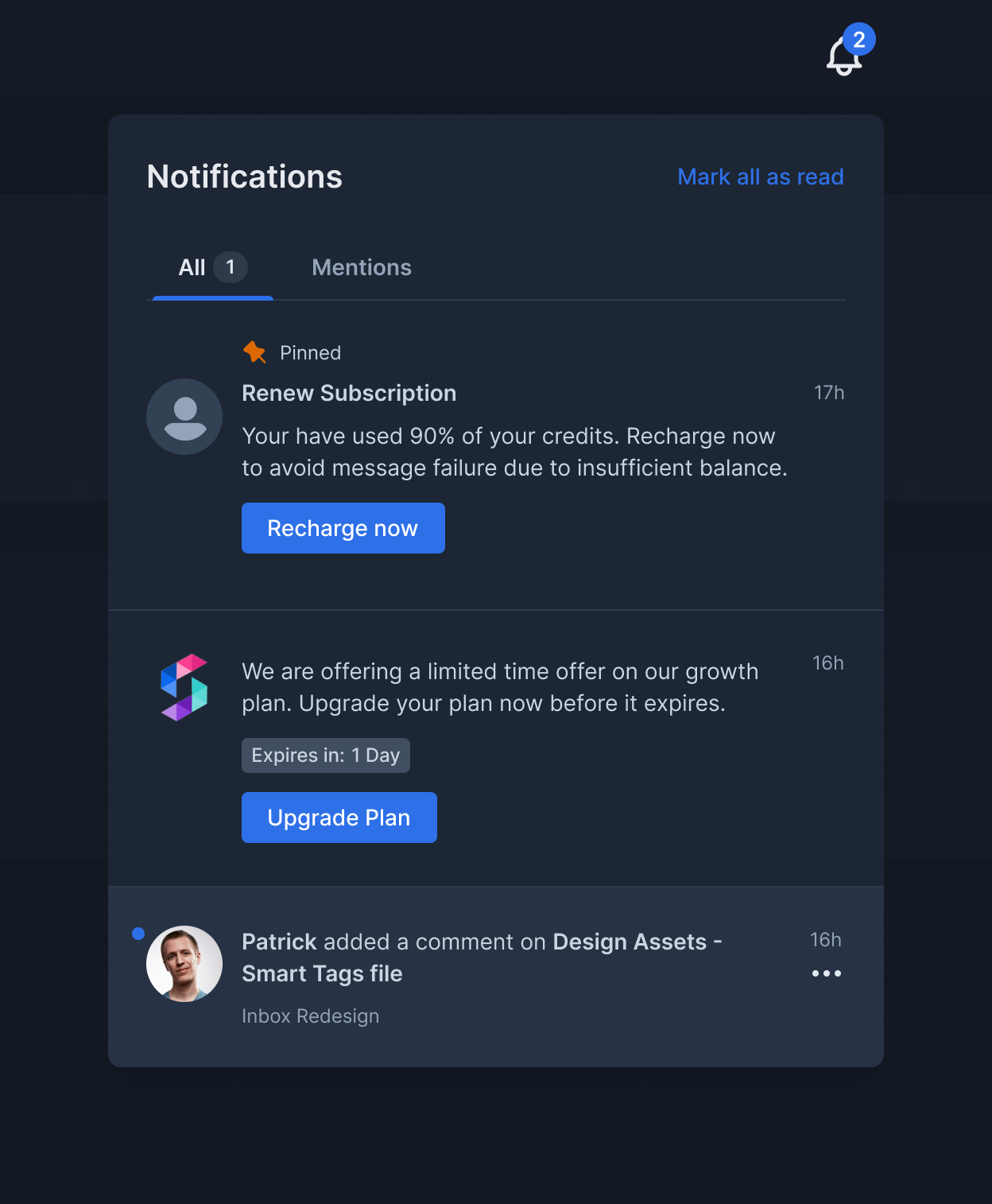
Custom notification card click handler

Clicking on notification card will open the link if Action URL field is present in triggered inbox template. If you want to override this with your custom callback function you can pass notificationClickHandler.

suprsendConfig = {
  inbox: {
    notificationClickHandler: {
      (notificationData: IRemoteNotification) => {
        console.log("notification clicked", notificationData.n_id);
      }
    }
  }
}

Custom action button click handlers

Clicking on action buttons in notification card will open link if you provide url on action button fields in triggered inbox template. If you want to override this with your custom action button callback functions you can pass primaryActionClickHandler and secondaryActionClickHandler.

suprsendConfig = {
  inbox: {
    primaryActionClickHandler = {
      (notificationData: IRemoteNotification) => {
        console.log('primary action button clicked', notificationData.n_id)
      }
    }
    secondaryActionClickHandler = {
      (notificationData: IRemoteNotification) => {
        console.log('secondary action button clicked', notificationData.n_id)
      }
    }
  }
}

Popover position

Popover component is wrapper around NotificationFeed component and will be opened on click of bell icon. By default popover is shown at bottom ie., the inbox notifications popup list will be shown at bottom of the bell icon.

Example: Feed needs to be shown at bottom of left sidebar above profile icon, in that case on click of bell icon you would want to show notifications popover at right side.

 suprsendConfig = {
   inbox: {
     popperPosition: "top / bottom / left / right"
   }
 }

Customising CSS styles

You can customize the CSS of the provided components by passing theme prop. You can pass the styles for the following components:

interface ITheme {
  bell ? : {
    height ? : number | string;
    width ? : number | string;
    color ? : string;
  };
  badge ? : React.CSSProperties;
  header ? : {
    container ? : React.CSSProperties;
    headerText ? : React.CSSProperties;
    markAllReadText ? : React.CSSProperties;
  }
  tabs ? : {
    color ? : string;
    unselectedColor ? : string;
    bottomColor ? : string;
    badgeColor ? : string;
    badgeText ? : string;
  };
  notificationsContainer ? : {
    container ? : React.CSSProperties;
    noNotificationsText ? : React.CSSProperties;
    noNotificationsSubtext ? : React.CSSProperties;
    loader ? : { color ? : string };
  };
  notification ? : {
    container ? : React.CSSProperties & {
      borderBottom ? : string | number;
      readBackgroundColor ? : string;
      unreadBackgroundColor ? : string;
      hoverBackgroundColor ? : string;
    };
    pinnedIcon ? : {
      height ? : number | string;
      width ? : number | string;
      color ? : string;
    };
    pinnedText ? : React.CSSProperties;
    headerText ? : React.CSSProperties;
    bodyText ? : React.CSSProperties & {
      blockquoteColor ? : string;
      tableBorderColor ? : string;
      linkColor ? : string;
    };
    unseenDot ? : React.CSSProperties;
    avatar ? : React.CSSProperties;
    createdOnText ? : React.CSSProperties;
    subtext ? : React.CSSProperties;
    expiresText ? : React.CSSProperties & {
      expiringBackgroundColor ? : string;
      expiringColor ? : string;
    };
    actions ? : Array < {
      text ? : React.CSSProperties;
      container ? : React.CSSProperties & {
        hoverBackgroundColor ? : string;
      };
    } > ;
    actionsMenuIcon ? : {
      hoverBackgroundColor ? : string;
      height ? : number | string;
      width ? : number | string;
      color ? : string;
    };
    actionsMenu ? : React.CSSProperties;
    actionsMenuItem ? : React.CSSProperties & {
      hoverBackgroundColor ? : string;
    };
    actionsMenuItemIcon ? : {
      height ? : number | string;
      width ? : number | string;
      color ? : string;
    };
    actionsMenuItemText ? : React.CSSProperties;
  };
}

Internationalization

locale can be used to change language of feed. We support translations for below langauges internally. If you want to use other languages that are not supported by us or to override strings of existing languages, you can pass translations object.

suprsendConfig = { locale: "fr" };
suprsendConfig = { translations: { "notifications": "All Notifications", "markAllAsRead": "Mark Read All" } };