{{variable_name}}).
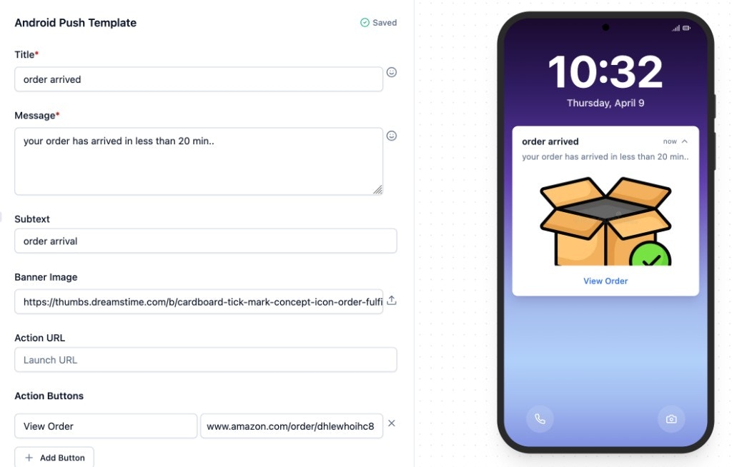
Android Push fields
Title - single-line heading. Keep under 40 characters - Android truncates to one line. Supports Handlebars variables. Small Icon - icon in the status bar and notification header. Defaults to the SuprSend bell icon. See custom icon setup to use your app icon. Large Icon - appears left of the text on Android 4.0–6.0, right on Android 7.0+. Defaults to your organisation logo (set in Organisation Settings). Message - multi-line body text. Front-load key info in the first 2 lines (expanded view shows ~6 lines). Supports Handlebars variables. Subtext - optional. Appears next to your brand name at the top of the notification. Banner Image - optional. Supported formats: PNG, JPG, JPEG. Recommended: 2:1 aspect ratio, under 700 KB. Static uploads are auto-scaled and optimised by SuprSend. Action URL - URL opened on notification tap. Supports deep links and Handlebars variables. Action Buttons - optional. Up to 3 buttons with label + URL. Use 1-2 buttons with concise labels (2-3 words): “Track Order”, “View Details”. Supports Handlebars in both fields. Button colour is set in Organisation Settings.Expo SDK supportWhen delivering Android Push via the Expo SDK, only the following fields are supported:
- Title
- Message (Body)
- Banner Image
- App Icon
- Sound
- Custom Key-Value Pairs
Adding dynamic content in Android Push
There will always be the case where you would be required to add dynamic content to a template, so as to personalise it for your users. To achieve this, you can add variables in the template, which will be replaced with the dynamic content at the time of sending push. To send actual values to replace variables at the time of communication trigger, use one of our frontend or backend SDKs. Here is a step-by-step guide:Add variables in the Variables panel
Add sample data in the Variables panel (Input Payload section) on the left side of the editor. If you have declared the variables and added sample data, they will come as auto-suggestions when you type a curly bracket
{. This removes the chances of error like variable mismatch at the time of template rendering. To see how to declare variables, refer to this section in the Templates documentation.Use variables in the template
We support
handlebars to add variables in the template. As a general rule, all the variables have to be entered within double curly brackets: {{variable_name}}Note that you will be able to enter a variable name even when you have not declared it in the Variables panel. To manually enter the variable name, follow the handlebars guide here.Below are some examples:- To enter a nested variable:
{{event.location.city}} - To refer to an array element:
{{array.[0].product_name}} - If you have a space in the variable name:
{{event.[first name]}}
- The variable is defined in the Variables panel.
- The variable name matches the Handlebars syntax exactly.
Advanced configurations
| Field | Type | Description |
|---|---|---|
| Silent | Boolean | Users won’t see this message. Triggers background activities using the notification payload. Useful for data sync, content pre-fetching, or breaking news alerts. |
| Timeout | Numeric | Auto-dismiss after N seconds if the user hasn’t interacted. Combine with Sticky for urgent time-limited alerts (for example, 2FA prompts). |
| Sticky Notifications | Boolean | Prevents swipe-dismiss. Removed only when the user taps the notification. |
| Notification Group | Text | Group name to stack related notifications (for example, chat messages from the same conversation) to avoid flooding the tray. |
| App Icon (Small Icon) | Text | Icon name without extension. See custom icon setup in the FAQ below. |
| Sound | Text | Sound file name. See custom sound setup in the FAQ below. |
| Custom Key-Value Pairs | Key-value | Send custom data to the app. Both key and value are strings. Combine with silent notifications for background data updates. |
SDK version requirements:
- App icon: Android native and React Native SDK version 0.1.8+
- Custom sound: Android native and React Native SDK version 2.2.0+
Expo SDK support for advanced configurationsFrom the table above, only App Icon, Sound, and Custom Key-Value Pairs are delivered through the Expo SDK. Silent, Timeout, Sticky Notifications, and Notification Group are not supported on Expo.
Preview and test
The right panel shows a live Android device preview, updated in real time as you edit. Variables render using data from the Variables panel. Click Test in the top-right corner to send a real push notification to a real device. This uses the live version - commit your changes before testing. See Testing a Template for the full guide.Commit
Click Commit in the top bar to publish the current draft as a new live version. Add an optional description for versioning. Once committed, all notifications triggered after this point use the new content.Common scenarios
Order update with tracking
Order update with tracking
| Field | Value |
|---|---|
| Title | Order #{{order_id}} shipped |
| Message | Your package is on the way! Expected delivery: {{delivery_date}} |
| Banner Image | {{product_image_url}} |
| Action URL | https://yourapp.com/track/{{order_id}} |
Silent data sync
Silent data sync
| Field | Value |
|---|---|
| Silent | ON |
| Custom Key-Value Pairs | sync_type = catalog_update, version = {{catalog_version}} |
Frequently asked questions
How do deep links work in push notifications?
How do deep links work in push notifications?
The Action URL and Action Button URLs support three URL types:
If your app supports App Links, prefer
| URL type | Format | Behaviour |
|---|---|---|
| Web URL | https://yourapp.com/orders/123 | Opens in the browser (or your app if App Links are configured) |
| Custom scheme | yourapp://orders/123 | Opens the matching activity in your app directly |
| App Link | https://yourapp.com/orders/123 (verified) | Opens your app directly without a browser redirect |
https:// URLs - they work as both web fallback and deep links.How do I add a custom app icon?
How do I add a custom app icon?
Add a small icon named
Use Android Asset Studio for quick icon generation. If you see the default bell icon, ensure all density sizes are present. If you see a solid square, the image lacks alpha transparency.SDK requirement: Android native and React Native SDK version 0.1.8+.
Expo SDK: App Icon is supported when delivering via the Expo SDK.
ic_suprsend_app_icon in the drawable folders of your app. Android only uses the alpha channel - the icon displays as monochrome in the status bar. You can use a vector drawable (androidApp/src/main/res/drawable/) or PNG icons at each density:| Density | Size |
|---|---|
| MDPI | 24x24 |
| HDPI | 36x36 |
| XHDPI | 48x48 |
| XXHDPI | 72x72 |
| XXXHDPI | 96x96 |
How do I add a custom notification sound?
How do I add a custom notification sound?
Add the sound file to
projectroot/app/res/raw (lowercase filename, underscores instead of spaces, for example notification_music.mp3).Important: On Android 8.0+ (~95% of users), sound is set at the notification channel level when the category is first created. Changing the sound in the template only takes effect for:- a new preference category
- a user installing the app for the first time
- a user who uninstalled and reinstalled the app
How does SuprSend optimise push notification images?
How does SuprSend optimise push notification images?
For static images uploaded in the Banner Image field, SuprSend applies two optimisations:
- Screen width - large images are resized to fit the user’s mobile screen width.
- Network-aware - image quality is adjusted based on the user’s connection (WiFi, 4G, 3G, 2G) to improve delivery speed on slow networks.
What are silent notifications used for?
What are silent notifications used for?
Silent notifications deliver a payload to the app without displaying anything to the user. Use them for background data sync, content pre-fetching, or triggering app-level logic. Combine with Custom Key-Value Pairs to pass structured data.
What happens if a variable is missing at send time?
What happens if a variable is missing at send time?
SuprSend discards the Android Push notification for that user. Other channels in the same template group (email, SMS, etc.) are still sent if they render successfully.