
If you are not using any of the In-build UI
components while
designing your custom UI for feed, you can
use @suprsend/react-core SDK.
These hooks and context providers are available in
both
@suprsend/react-core and @suprsend/react SDK’s. Integration steps
mentioned in this guide are also same for both.Pre-Requisite
Integrate SuprSendProvider as it is needed for creating SuprSend Client and authenticating user.Installation
Integration
SuprSendFeedProvider
This provider internally creates InApp feed client instance and also removes it on unmounting. This should be called inside SuprSendProvider. FeedClient can be accessed using useFeedClient hook.tenantId defaults to the active tenant set in SuprSendProvider, else the default tenant. Passing it here pins the feed instance to that tenant — it takes priority over the active tenant and the feed ignores later tenant changes. Without it, the feed re-initializes automatically whenever the active tenant changes.
If you are passing tenantId in feed, make sure it matches scope.tenant_id passed while creating userToken else error will be thrown due to scope mismatching.
reachability defaults to false. Pass it to track whether the feed is working for this user. See Tracking reachability.
useFeedClient
This hook is used to get Feed client instance. Using this instance you can access feed methods like mark seen, archive, read etc. Use this hook inside SuprSendFeedProvider.useFeedData
This hook returns react state that contains notification store data which includes notifications list and other meta data. This state gets updated internally when there is any update in store. Use this state to render UI in your application. Use this hook inside SuprSendFeedProvider.Tracking reachability
Reachability tells you whether the feed is working for this user right now. It combines three checks into one status — the browser is online, the feed socket is live, and the feed API is reachable — so you can show your own dot or banner when new notifications may be missing. It’s off by default. Passreachability to SuprSendFeedProvider, then read it with useFeed() inside that provider. reachability is React state, so your component re-renders when the overall status, socket.status, api.status or api.authError changes. It’s undefined when the provider doesn’t have reachability set.
The status is one of ONLINE, CONNECTING, DEGRADED, AUTH_ERROR, OFFLINE or UNKNOWN. The React Inbox component renders a coloured dot and a banner for each status. Here’s how to render the same states in a custom feed:
- Online
- Connecting
- Connection issue
- Authentication error
- Offline
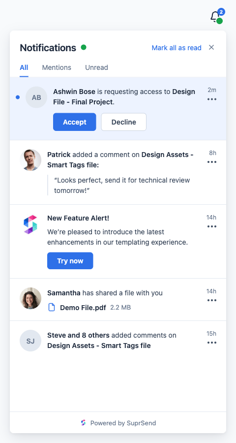
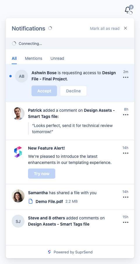
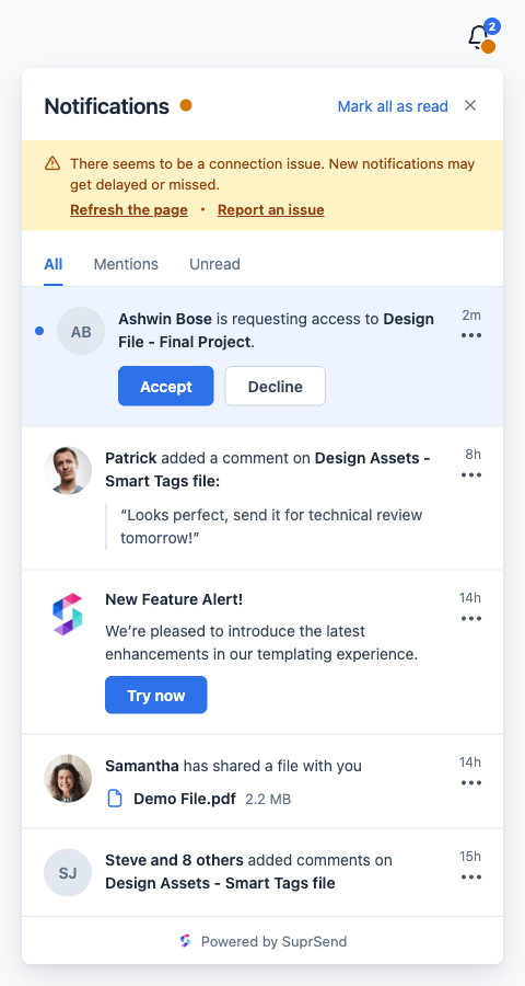
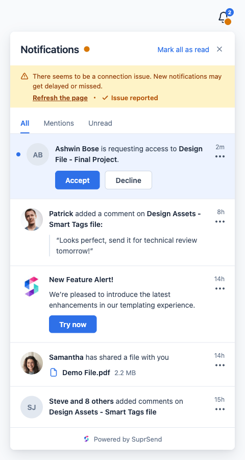
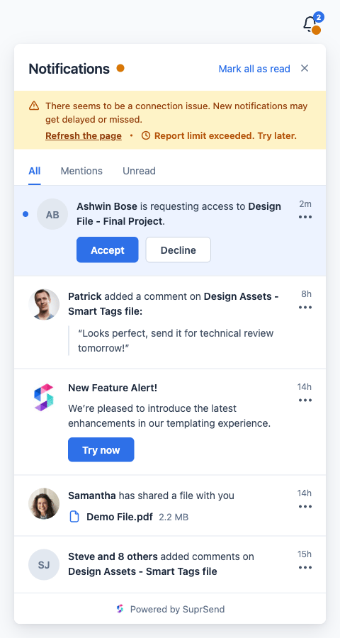
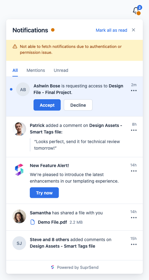
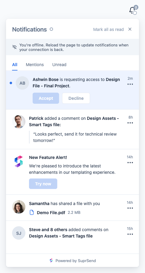
status is one of these values:
For the full
IFeedReachability shape, when the value changes and how each connection is tracked, see Tracking reachability in the JavaScript SDK.
Example
Using built-in components in headless implementation
We exported few inbuilt components you can use to save time while building your own UI. If you are using@suprsend/react-core and want to use these components please remove that package and install @suprsend/react, integration steps remain unchanged other than changing import statement.
NotificationCard component
This is single notification card component. It will be handy if you want to implement your own UI but want to just use our notification card as it has a bit complex logic and UI.
Please refer Customising CSS styles section to view typedefs for INotificationCardTheme.
BodyMarkdown component
This is simple div element but also supports rendering of markdown language. Read more about the component.Sample Notification JSON Structure
message Object Fields
You can understand more about usage and details of message fields in it’s template documentation.